From June '17 - April '19 I was freelance visual designer in Waternet's online team.
I designed new functionalities within 3-week sprints, thought along with the product owners about
expanding and improving the website(s), and I further expanded the online identity. I also started with a design system in Sketch.
I designed new functionalities within 3-week sprints, thought along with the product owners about
expanding and improving the website(s), and I further expanded the online identity. I also started with a design system in Sketch.
What I liked
I have been a Waternet customer for many years myself so I knew the points for improvement. The team was free to proactively create user stories for improvement. There was a lot of room for change and improvement. Waternet works strict agile and in my time here I became an agile pro. Sometimes even a substitute scrummaster. I kind of liked the structure and I enjoyed working in a close team.
Case
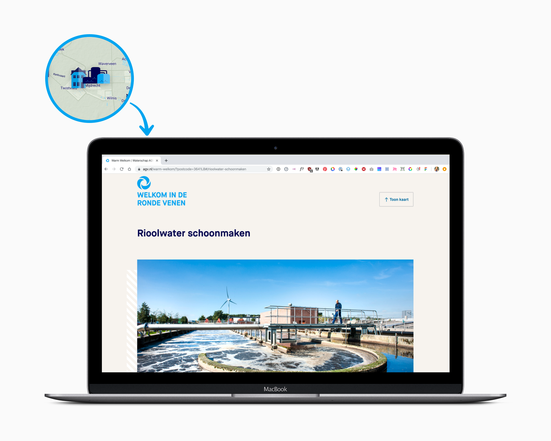
Warm Welkom


Problem
The first thing new customers of Waternet receive is a water tax bill or a drinking water bill. This is not a "warm", friendly introduction and could be done in a different way. Most customers don't even know what a water company is offering them in exchange of the bill/tax they pay.
What we did
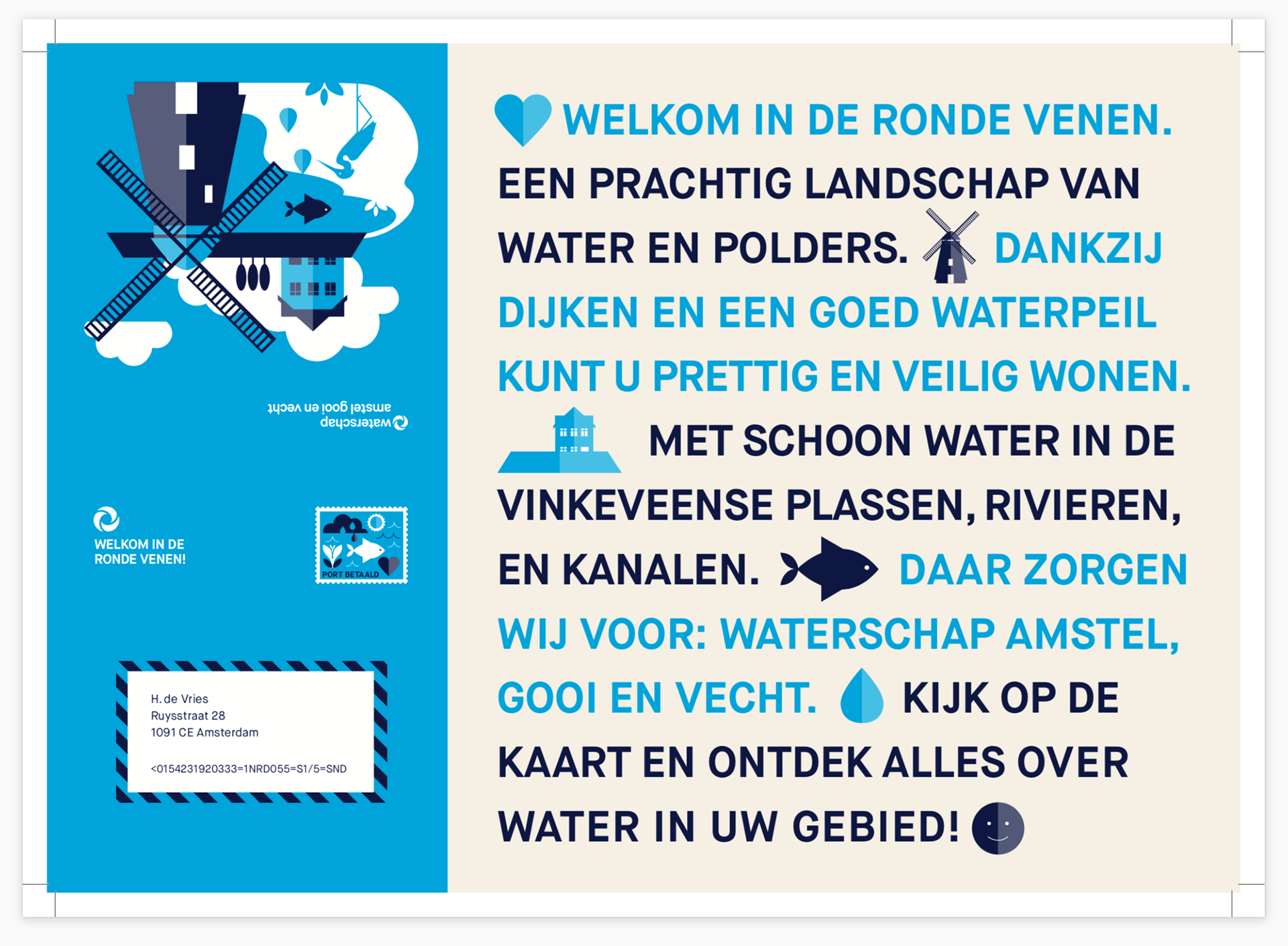
In a 1-week design sprint with a small team we made a demo from the most voted idea and this was tested the same week with stakeholders and customers. I designed a new complementary style with some new colours and elements which are also used on the paper map.
Result
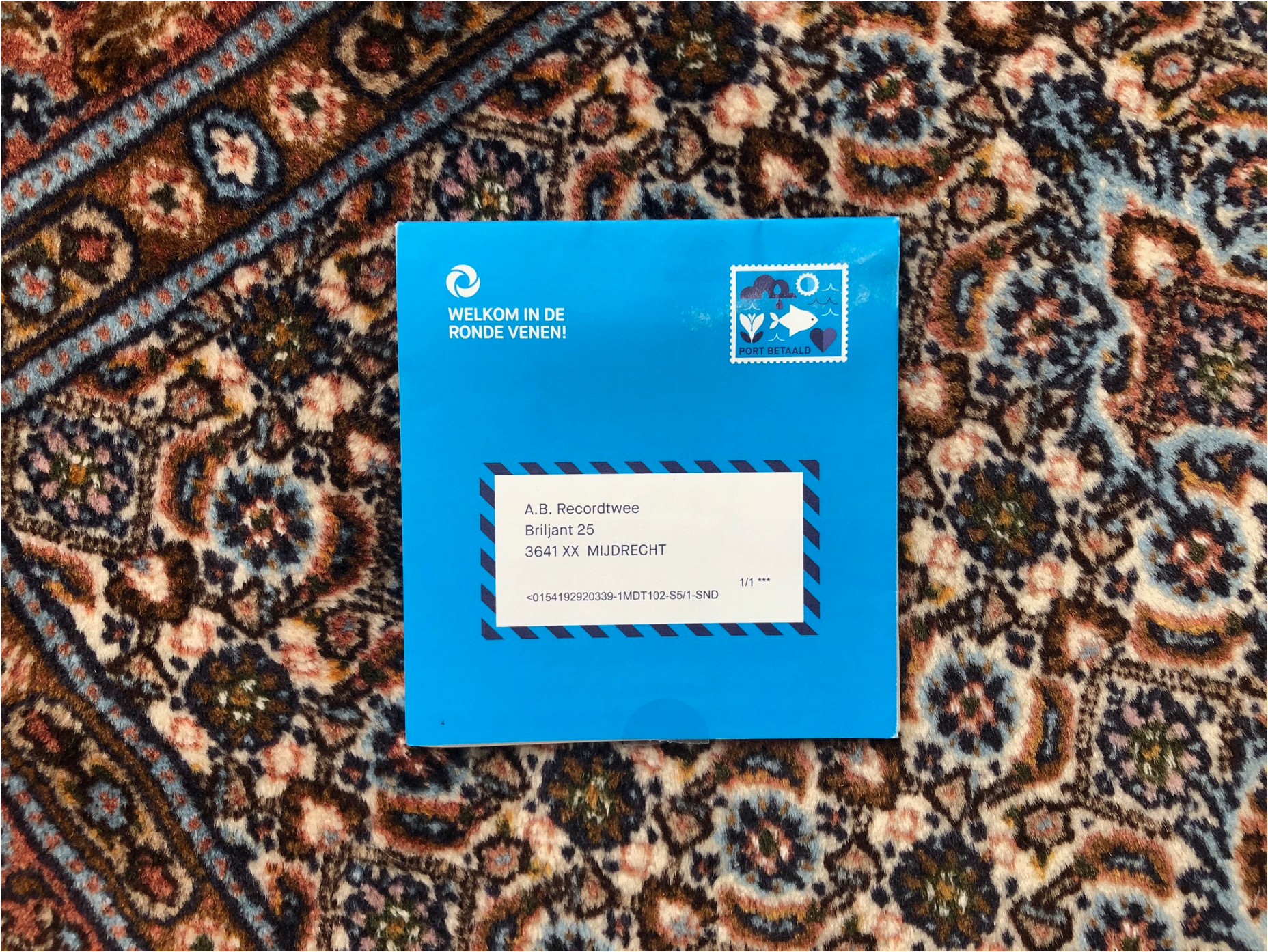
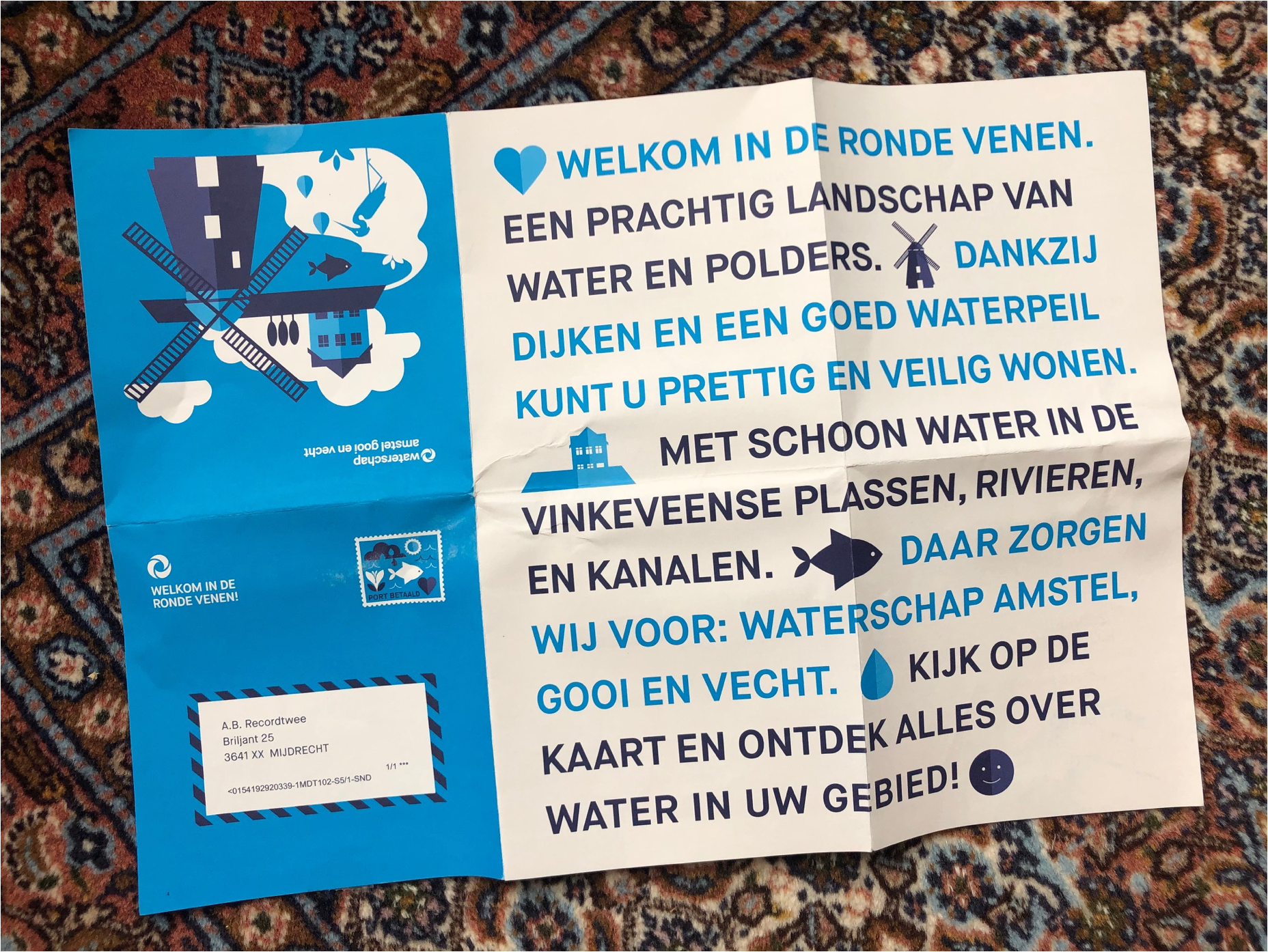
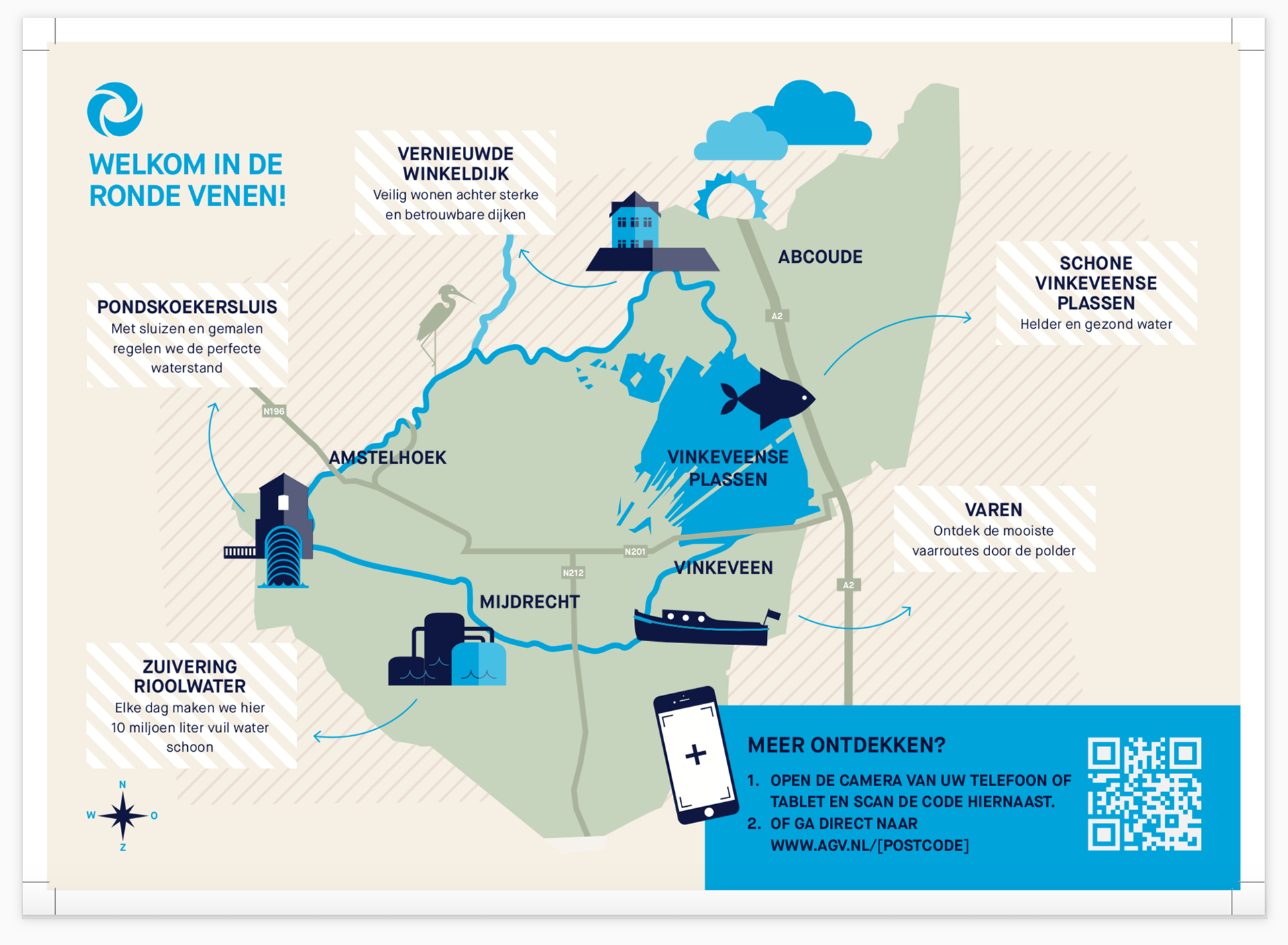
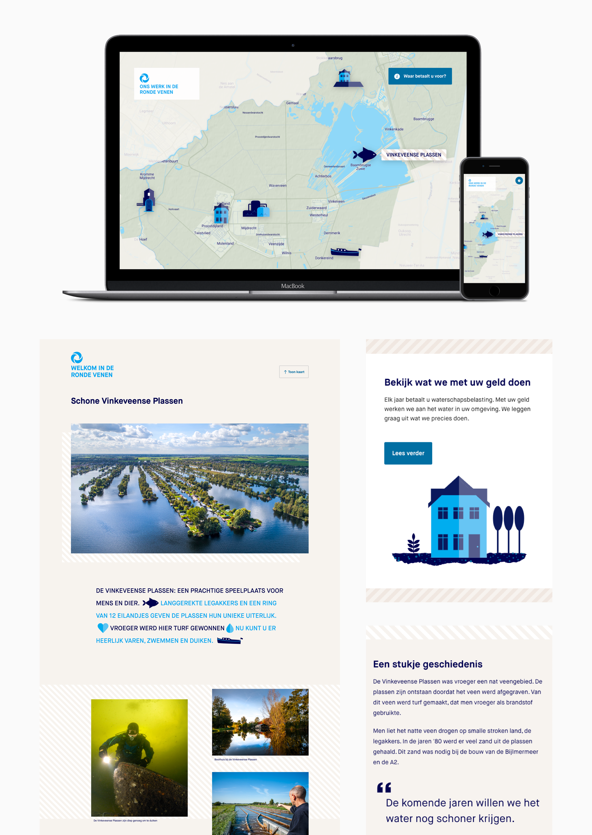
A welcoming concept for new customers who have just moved to a Waternet area, consisting of a paper map of the water area of their new hometown with assets (showpieces) from Waternet that can be visited. Through a QR code an online map can be visited.
On forehand we did research in the pilot area to see if the public was up for this kind of "fun" information. The outcome was positive. People were surprised when they heard that Waternet not only wanted to receive money from them, but was also responsible for pumping stations, water mills, clean recreational water, etc.
url
Amsterdam area:
https://www.agv.nl/warm-welkom/?postcode=1079CW#/ (my own home)
https://www.agv.nl/warm-welkom/?postcode=1079CW#/ (my own home)
Case
Ilustration language
Problem
It turned out to be difficult to find suitable and stylish visual material for waternet.nl.
Many pages within the site are different and are not yet in the planning for further development.
A lack of recognizable, clear and responsive image language.
What we did
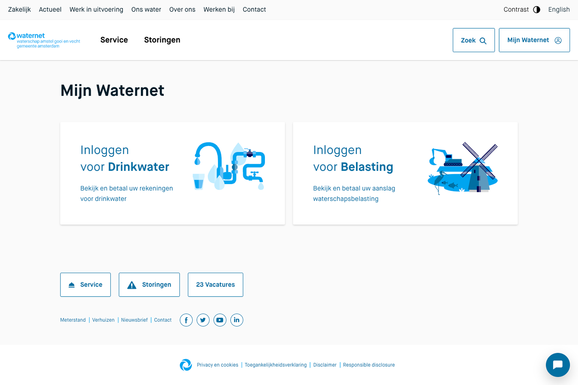
After making an inventory and the conclusion that many pages deal with multiple aspects of water use and encourage the user to take action, I thought it would be a good idea to work with illustrations which in the large versions would be a kind of mood boards and in the mobile versions an aspect of those mood boards.
My friend and illustratorAnnabelle Wallis worked out the illustrations and icons.
(I am more of an interface designer myself. )
Result
A recognisable consistent illustration style.
More work I did for Waternet:
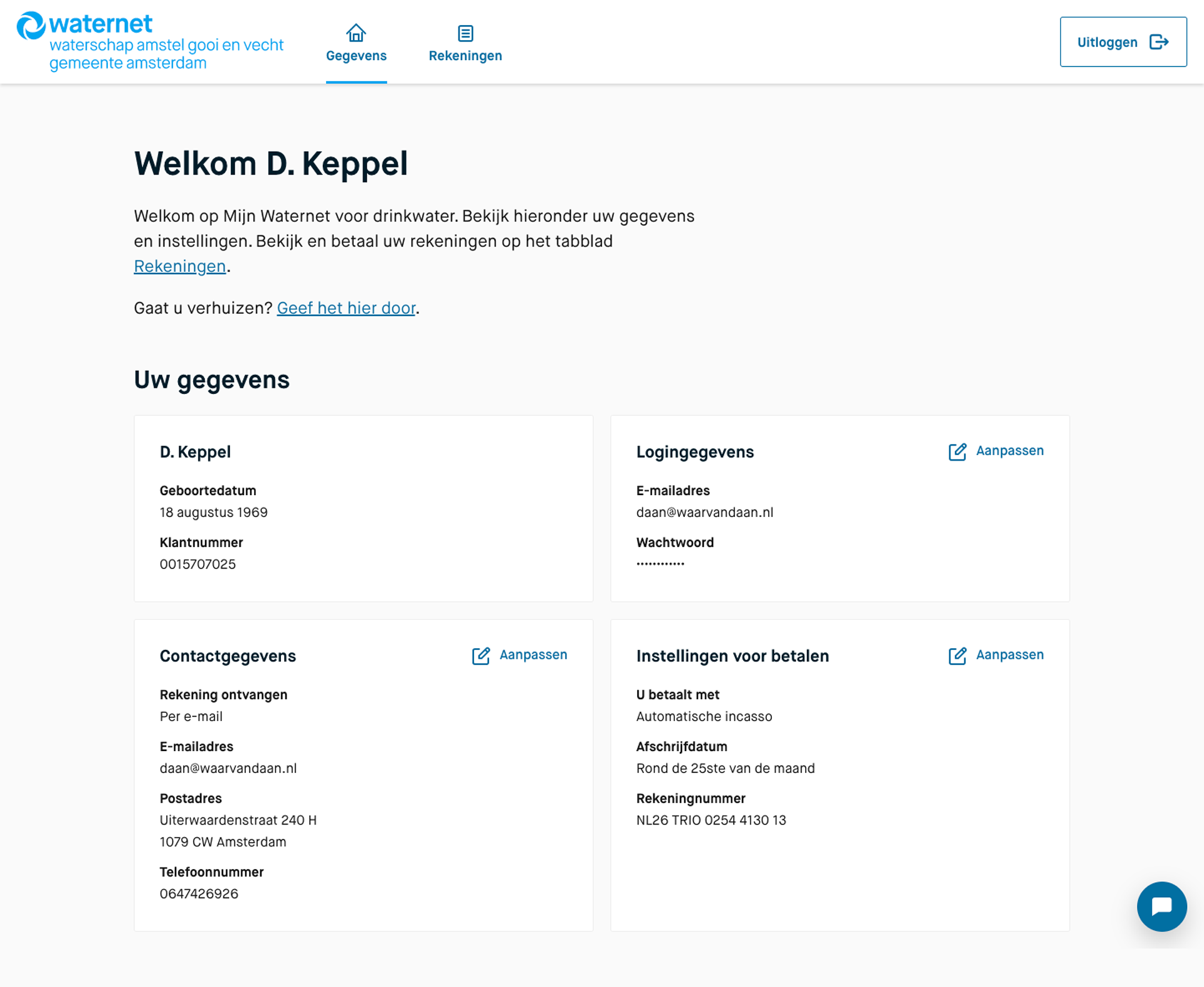
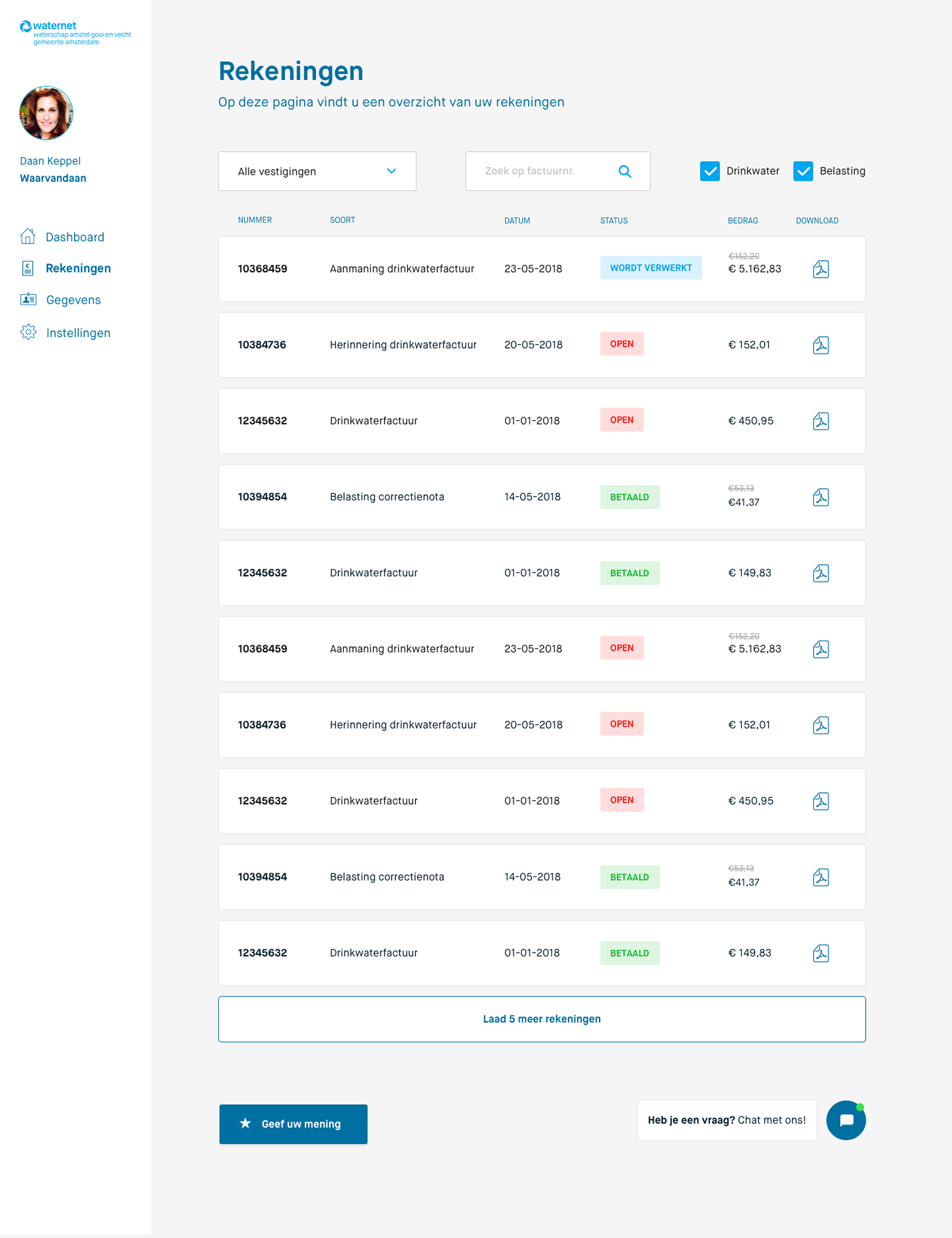
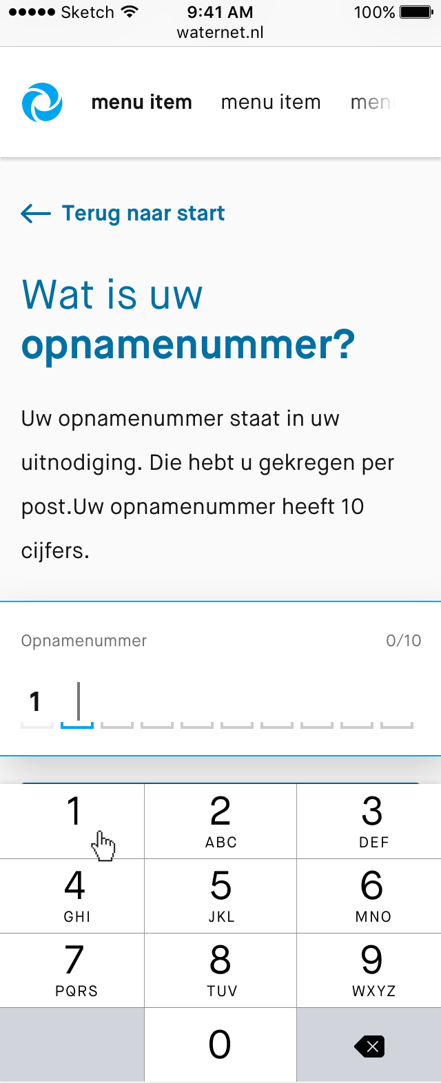
In the 20 months that I worked there, I designed many elements and components.
Among other things, everything that can be seen on the following pages,
from the main navigation to the footer:
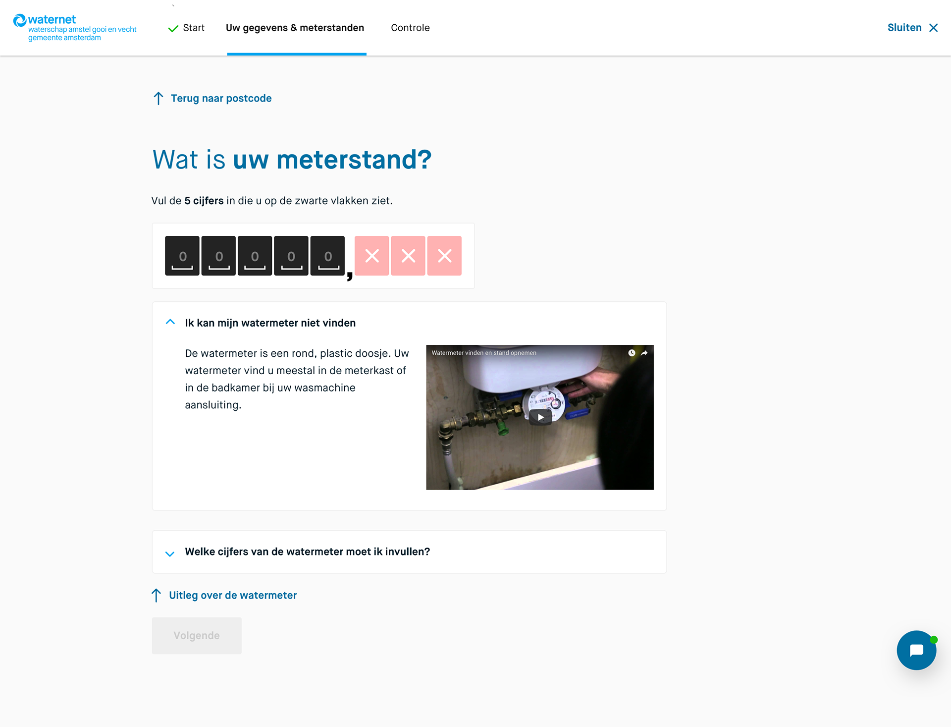
The funnel for submitting your water consumption:
https://www.waternet.nl/service-en-contact/meterstand/meterstand-doorgeven/#/
(you have to log in for this, view images)
https://www.waternet.nl/service-en-contact/meterstand/meterstand-doorgeven/#/
(you have to log in for this, view images)
The funnel for participating in Water policy issues: https://www.agv.nl/inspraak/zienswijze/#/

Agenda, tablet version
